I was given a chance to create a concept of brand identity for an indie rock band blending dream pop and rock, focused on human connection and futurism. The brand identity was supposed to be original and solid enough to state potential expansion for the brand.
Project Goal
The goal of this project was to create a complete brand identity for a newly formed indie band blending rock and dream pop. The task focused on defining the band’s personality, values, tone of voice, and long-term vision, and translating them into a cohesive communication system. The identity needed to express human connection, emotional depth, nostalgia, and futurism while remaining flexible across albums, posters, merchandise, social media, and live performances.
Project Moodboard
Visual Moodboard
Concept & Brand Idea
At the core of Human Gravity is the idea of invisible forces between people — emotional, romantic, friendly, and existential bonds that shape who we are. The concept combines human warmth, emotional openness, and hippie freedom with technology, science, and space exploration. Visually, this results in soft, expressive, almost psychedelic elements placed in contrast with structured, futuristic forms.
Inspired by John F. Kennedy’s “Why go to the moon?” speech, the identity reflects belief in progress, courage, and collective vision — not only as technological advancement, but as a deeply human and emotional journey.
Naming & Logo
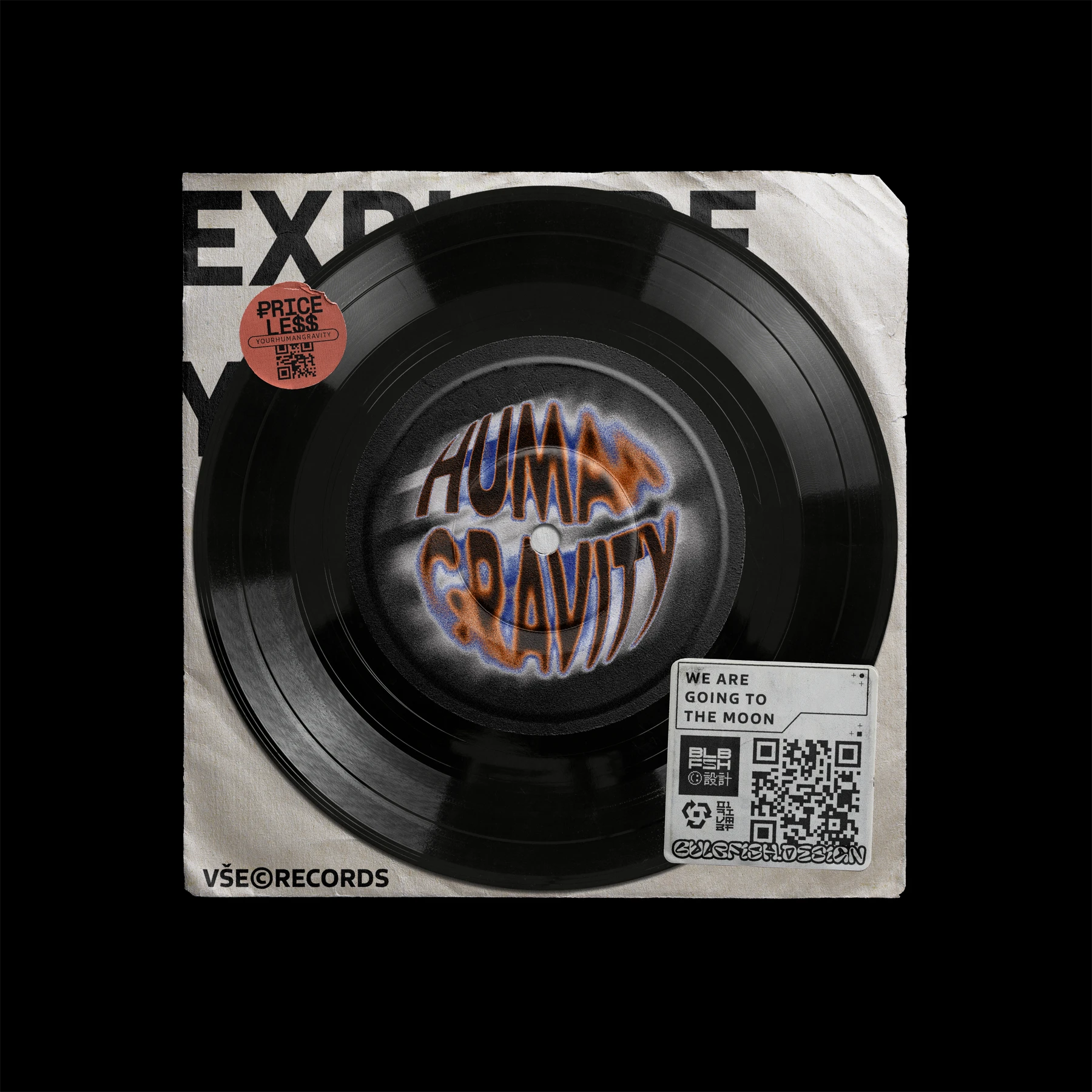
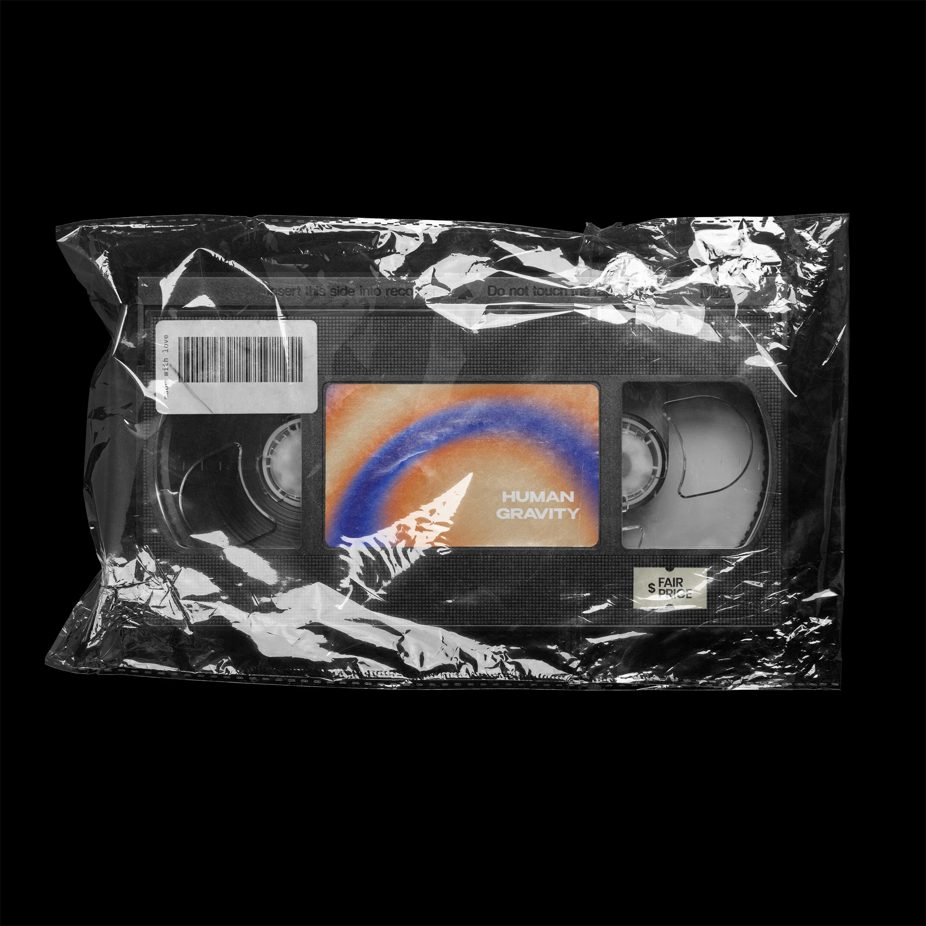
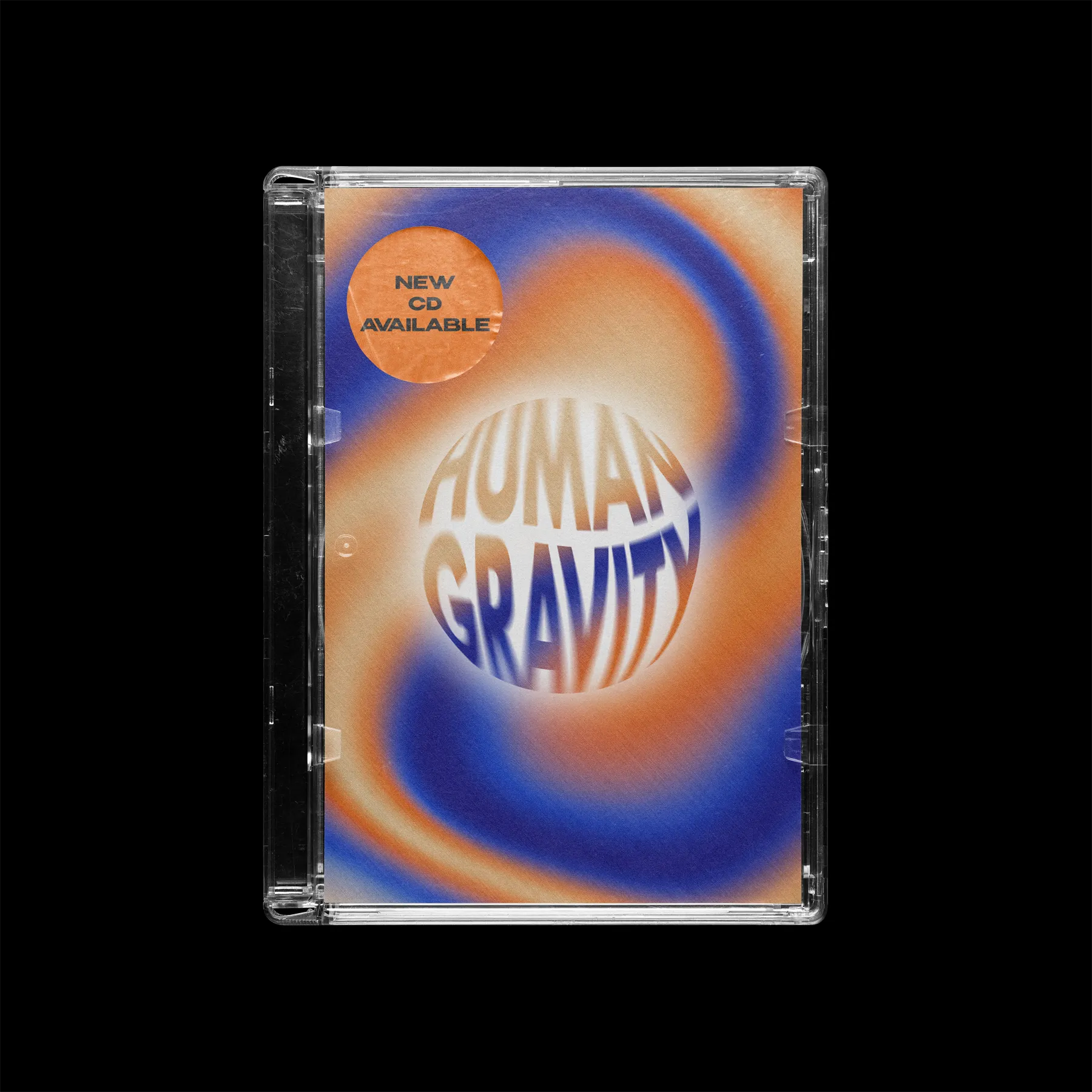
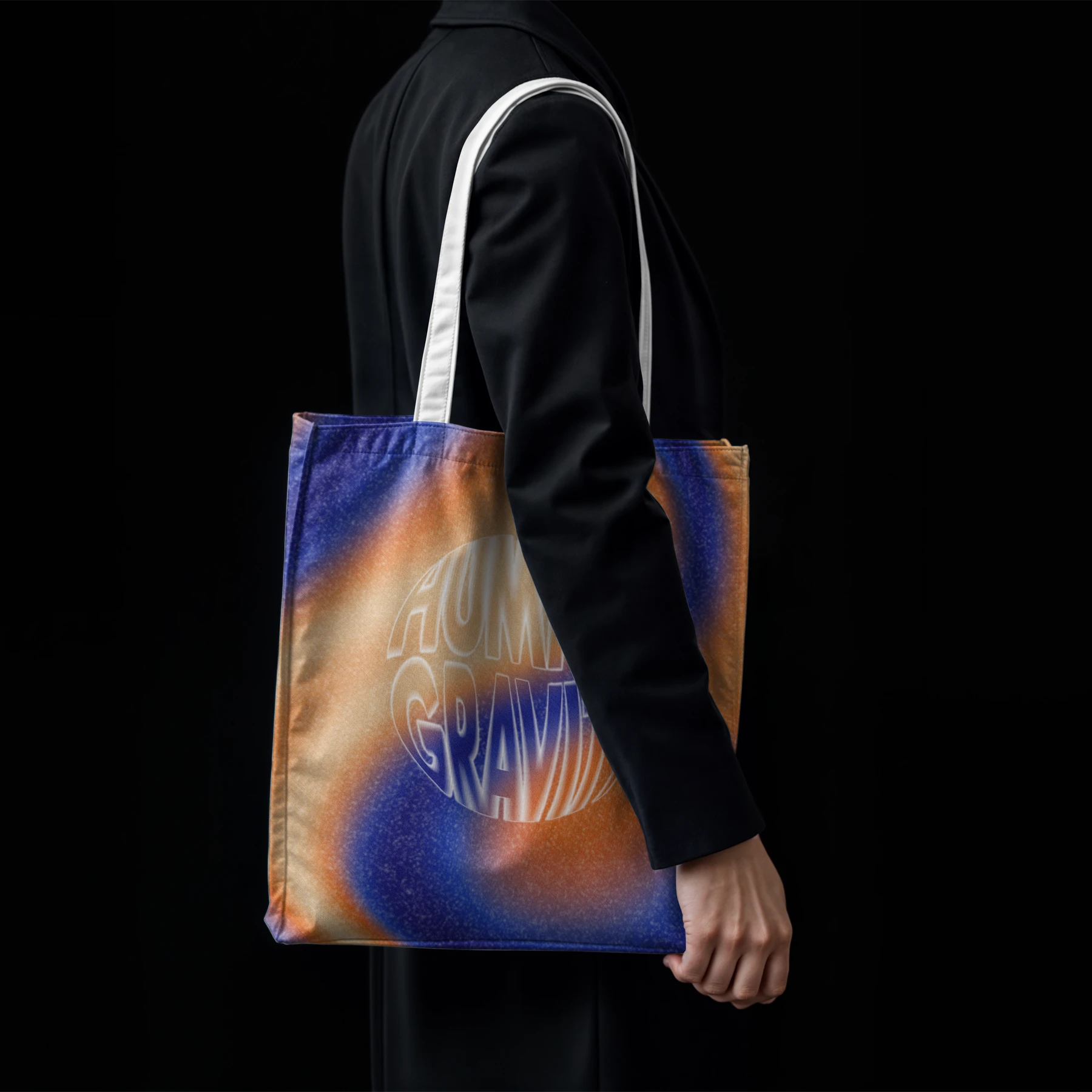
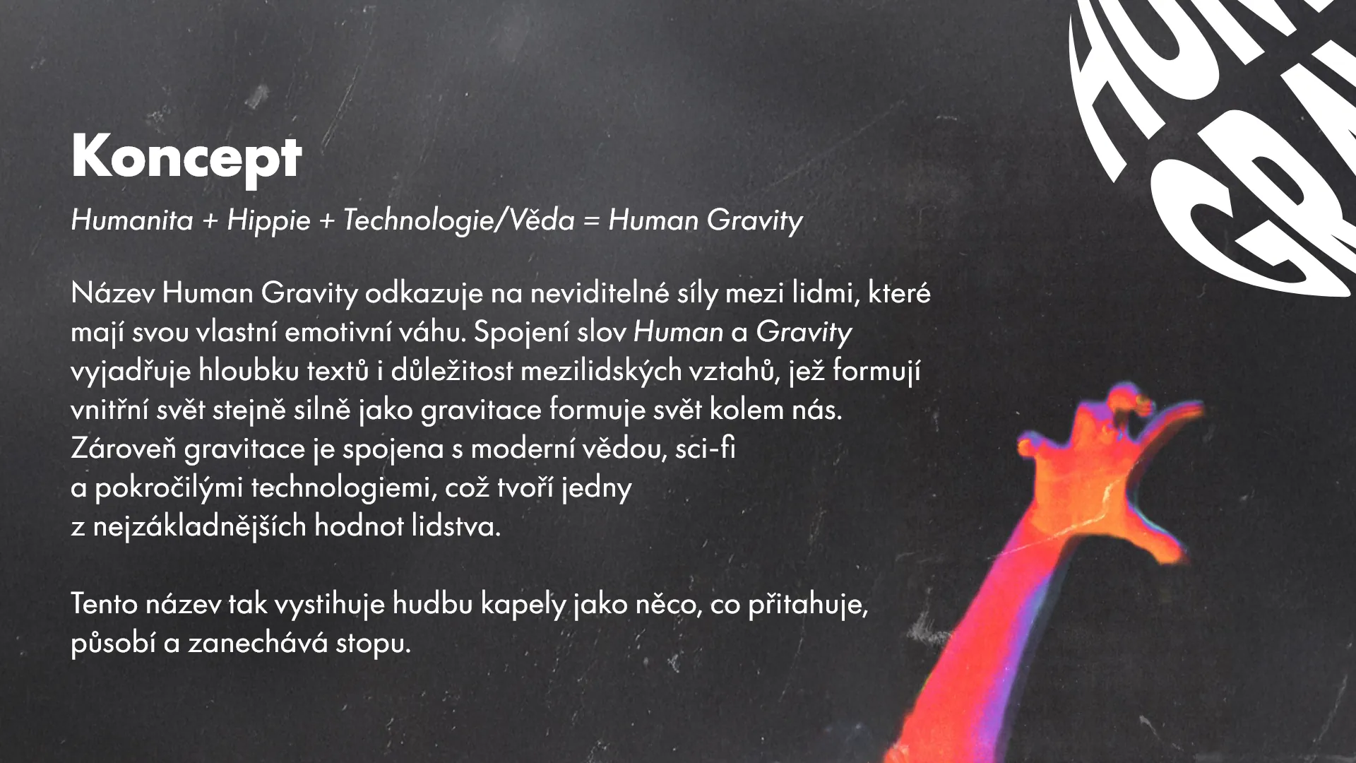
The name Human Gravity refers to invisible forces between people that carry emotional weight. The connection of the words Human and Gravity expresses both the depth of the band’s lyrics and the importance of interpersonal relationships, which shape our inner world as strongly as gravity shapes the physical one. At the same time, gravity is linked to modern science, sci-fi, and advanced technology, describing the music as something that pulls people in and leaves a lasting trace.
This idea is reflected in the logo, whose spherical form is based on the principles of gravity — the most stable shape in the universe. The shape also references our home planet and evokes an imagined view of Earth from space, symbolizing technological progress and exploration. The circular form also reinforces togetherness and human connection, while its simplicity allows the logo to work effectively in digital environments, across variations. In constrast to simplicity, the logo also can be used in a complex way with use of 3D to be the center of the visual work.
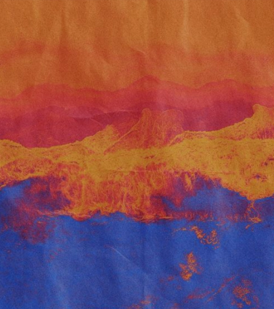
Color Palette
The color palette is inspired by retro and hippie visuals, particularly the warm optimism of 1960s America and early space-age culture. These tones are reinterpreted through gradients, creating a modern, emotional, and dynamic aesthetic. Gradients introduce movement and depth while reflecting the contrast between softness and intensity present in the music.
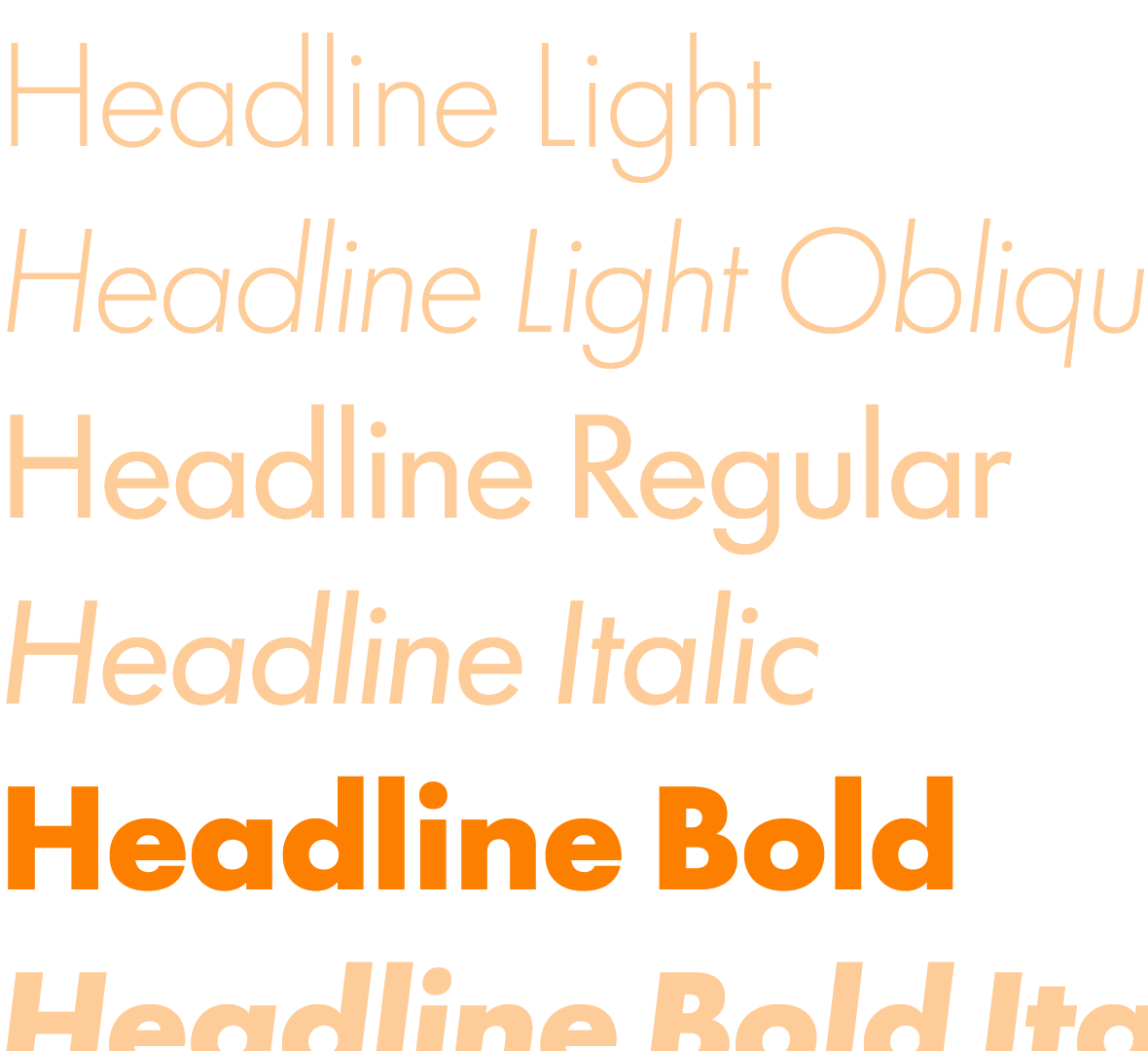
Typography
The typography system combines geometric clarity with expressive weight. Structured letterforms reference technological precision, while spacing and composition allow for freedom and emotion. Typography often works as a visual element on its own, supporting the brand’s recognizability even without imagery.
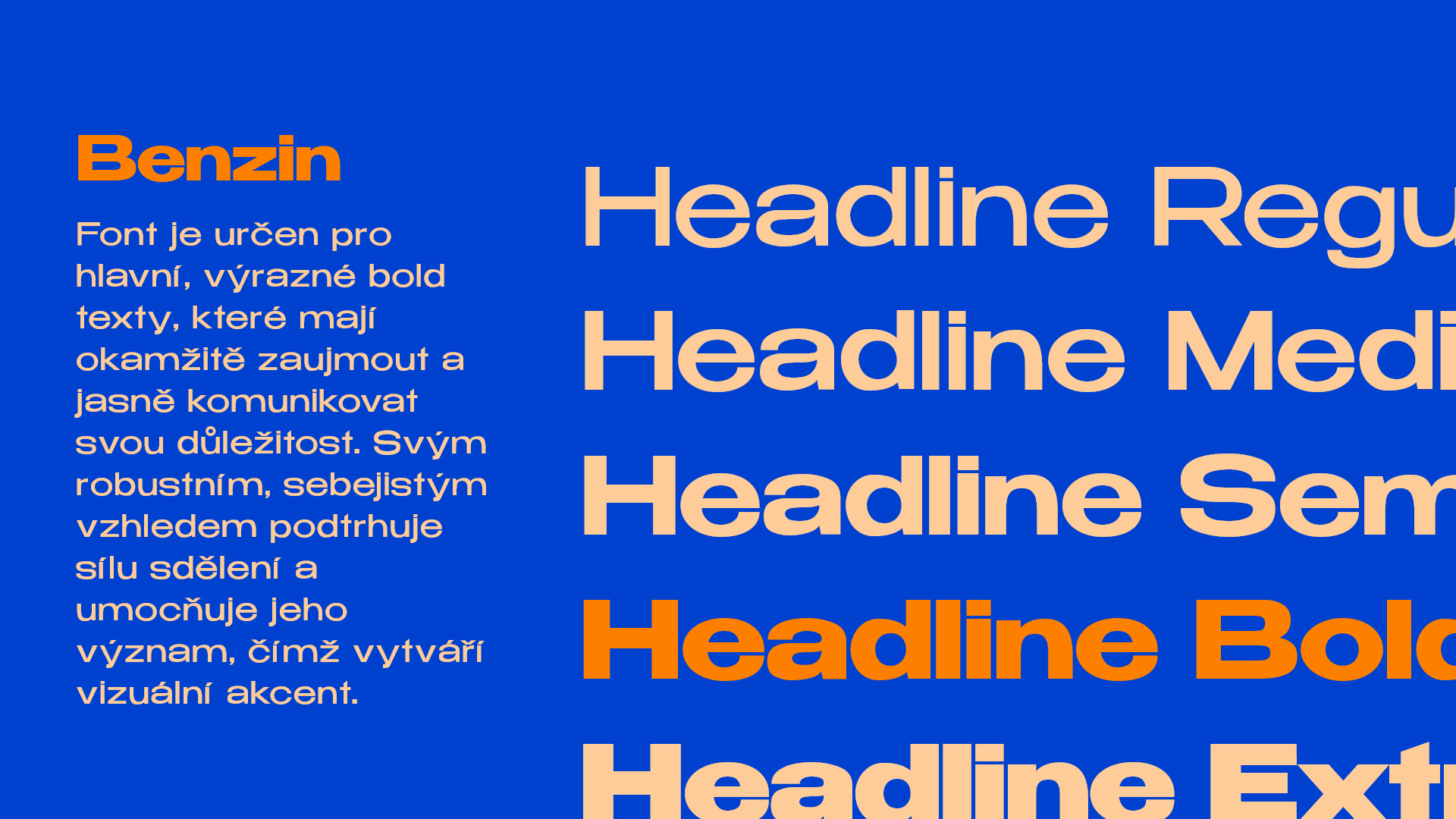
Benzin is reserved for main, strong bold statements—headings or key messages that must catch attention immediately. Its robust, confident look reinforces the strength of the message and creates a clear visual accent.
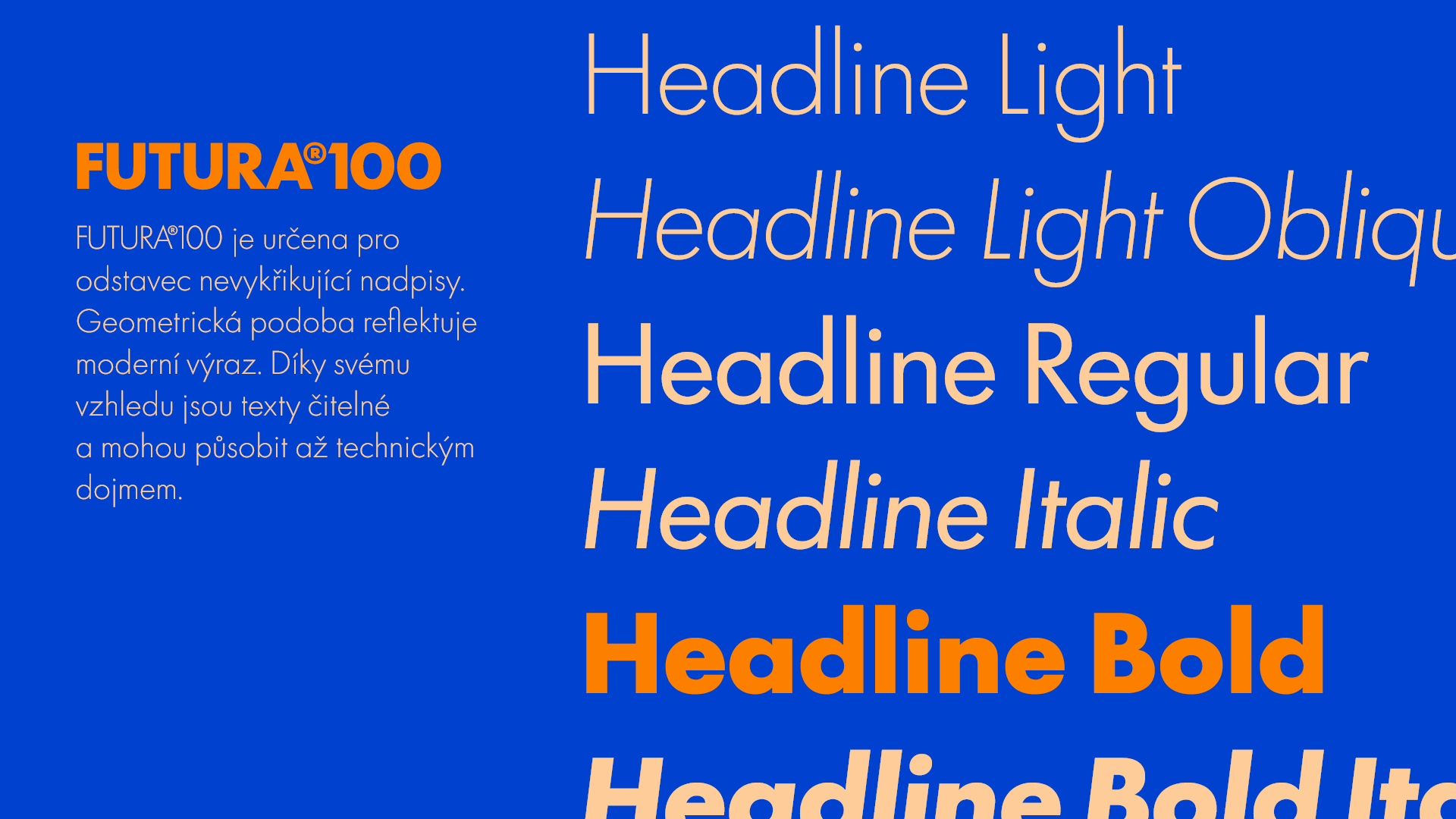
Futura 100 is used for body text and quieter headlines that don’t need to “shout.” Its geometric form keeps longer passages highly readable and clean.
Benzin
Futura 100
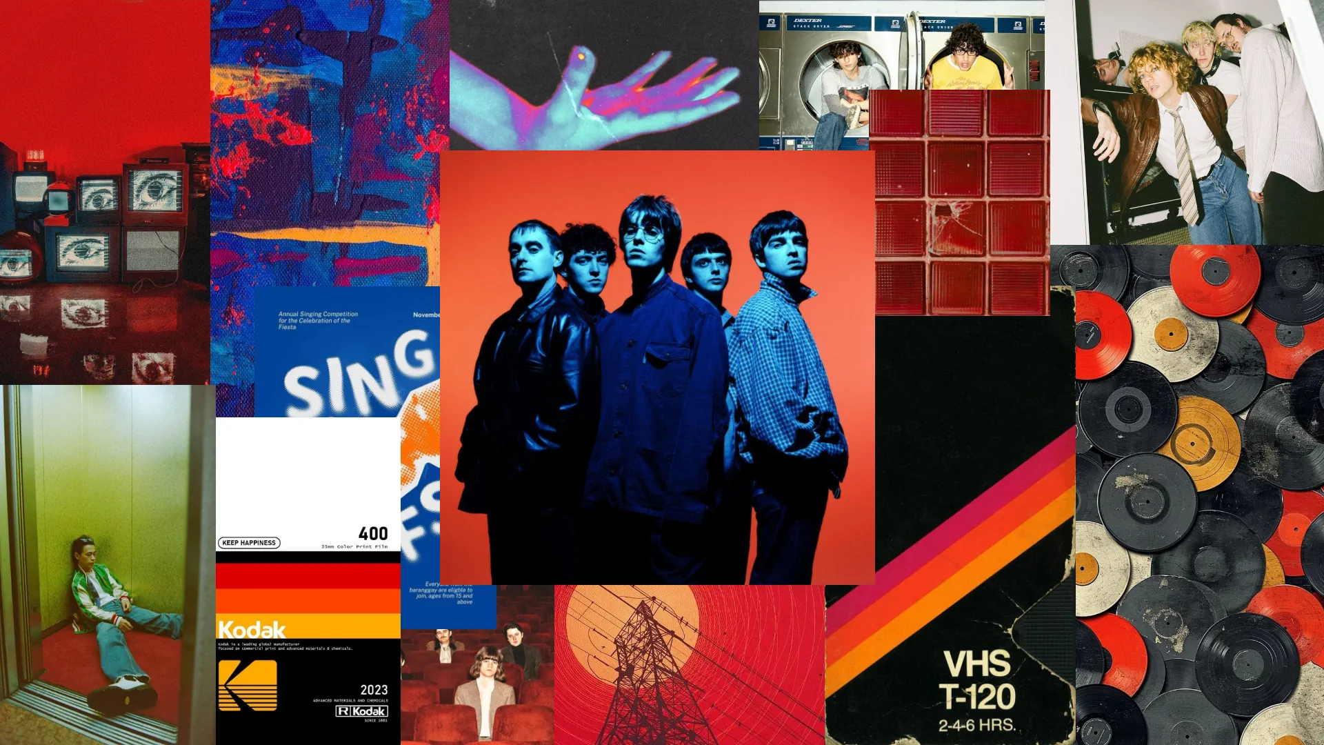
Application
The identity system is designed to work seamlessly across posters, vinyl and CD covers, merchandise, social media content, photography direction, and live visuals. Its modular structure allows for expressive variation while maintaining strong and consistent brand recognition across both digital and physical outputs. Here are some examples:
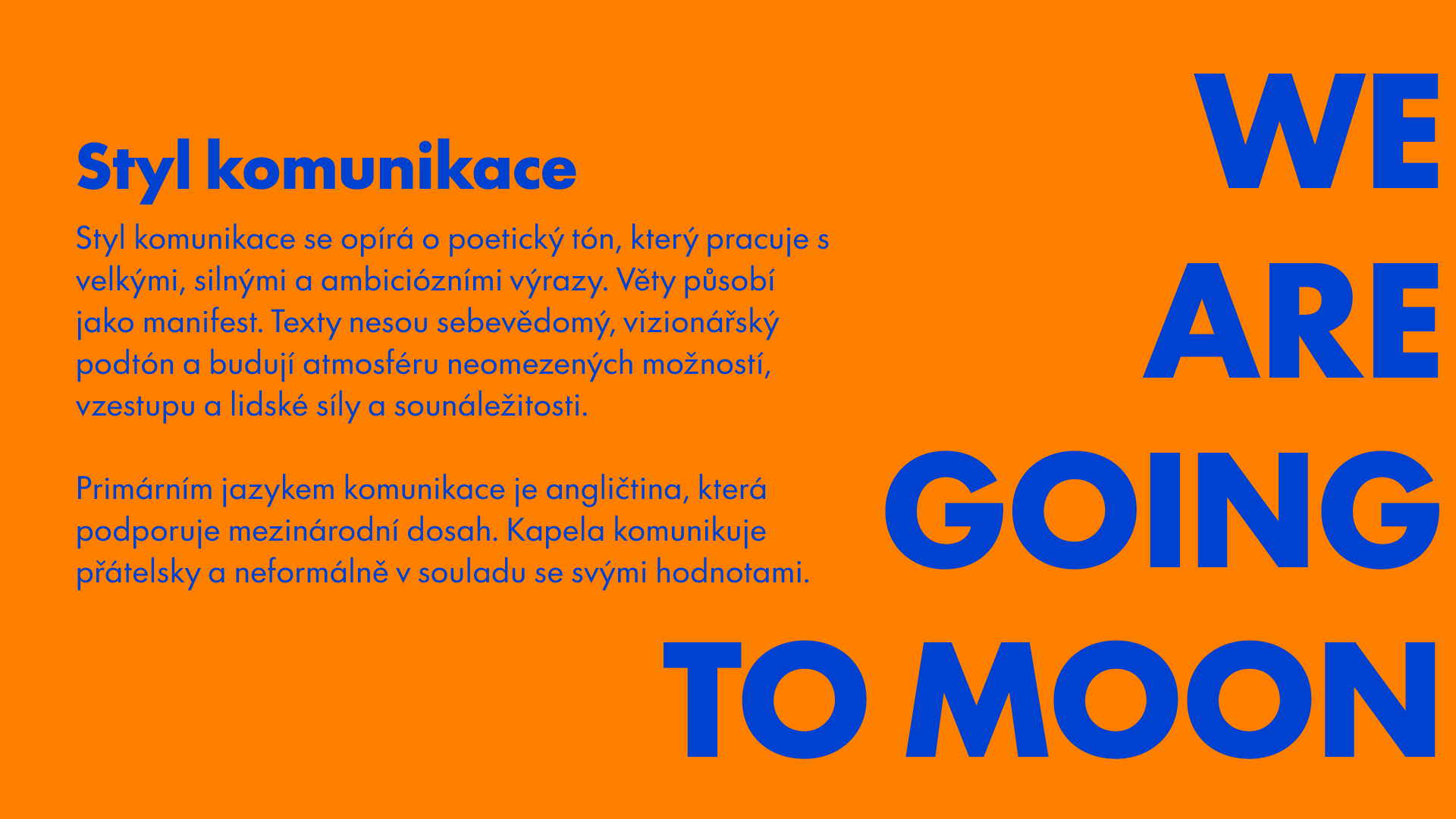
Tone of Voice
Human Gravity communicates in a poetic, manifesto-like tone. The language is confident, visionary, and emotionally charged, often using metaphors related to space, movement, and human strength. Communication feels ambitious yet approachable, reflecting both futuristic vision and human warmth. English is used as the primary language to support international reach.
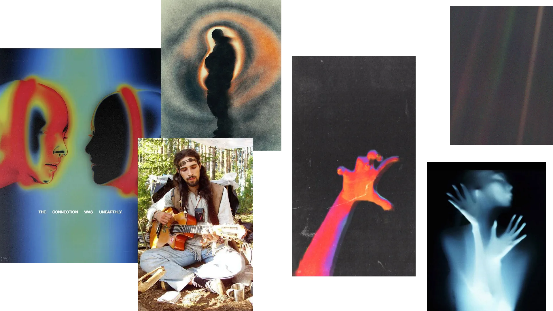
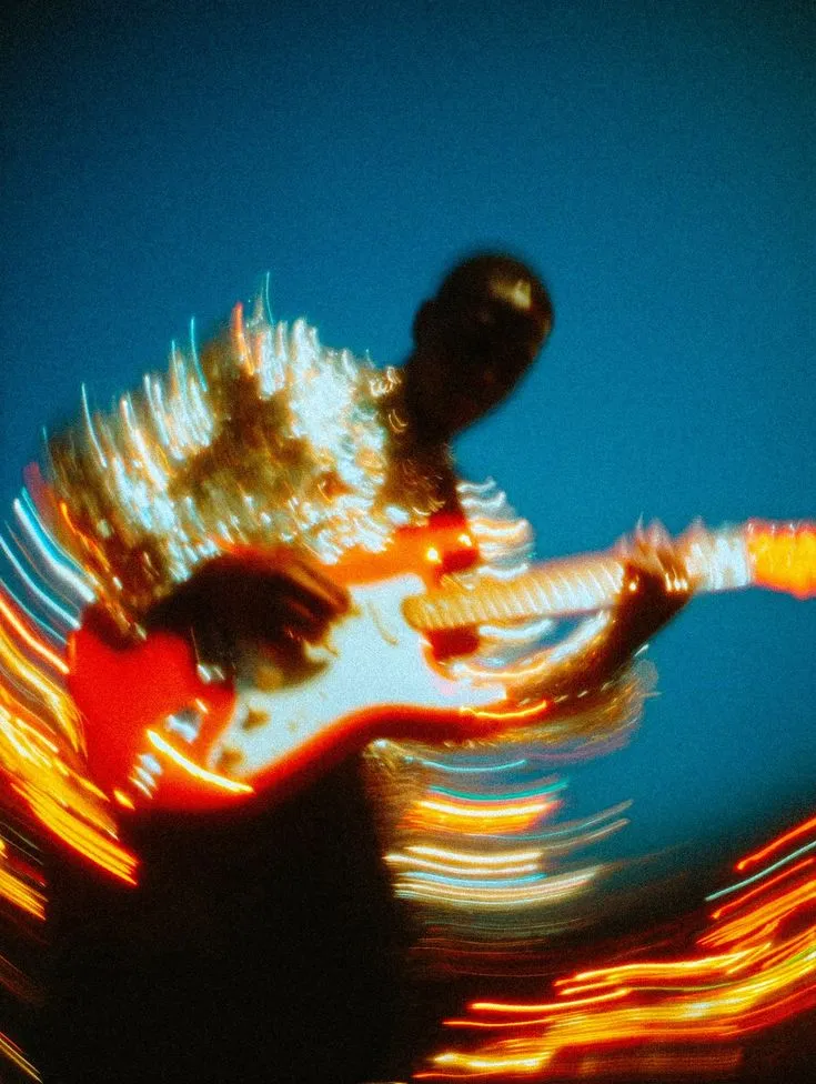
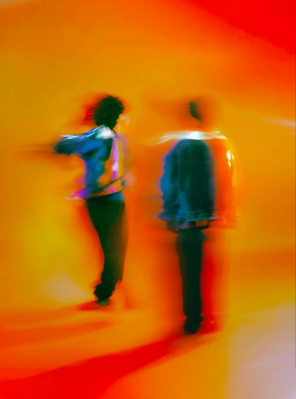
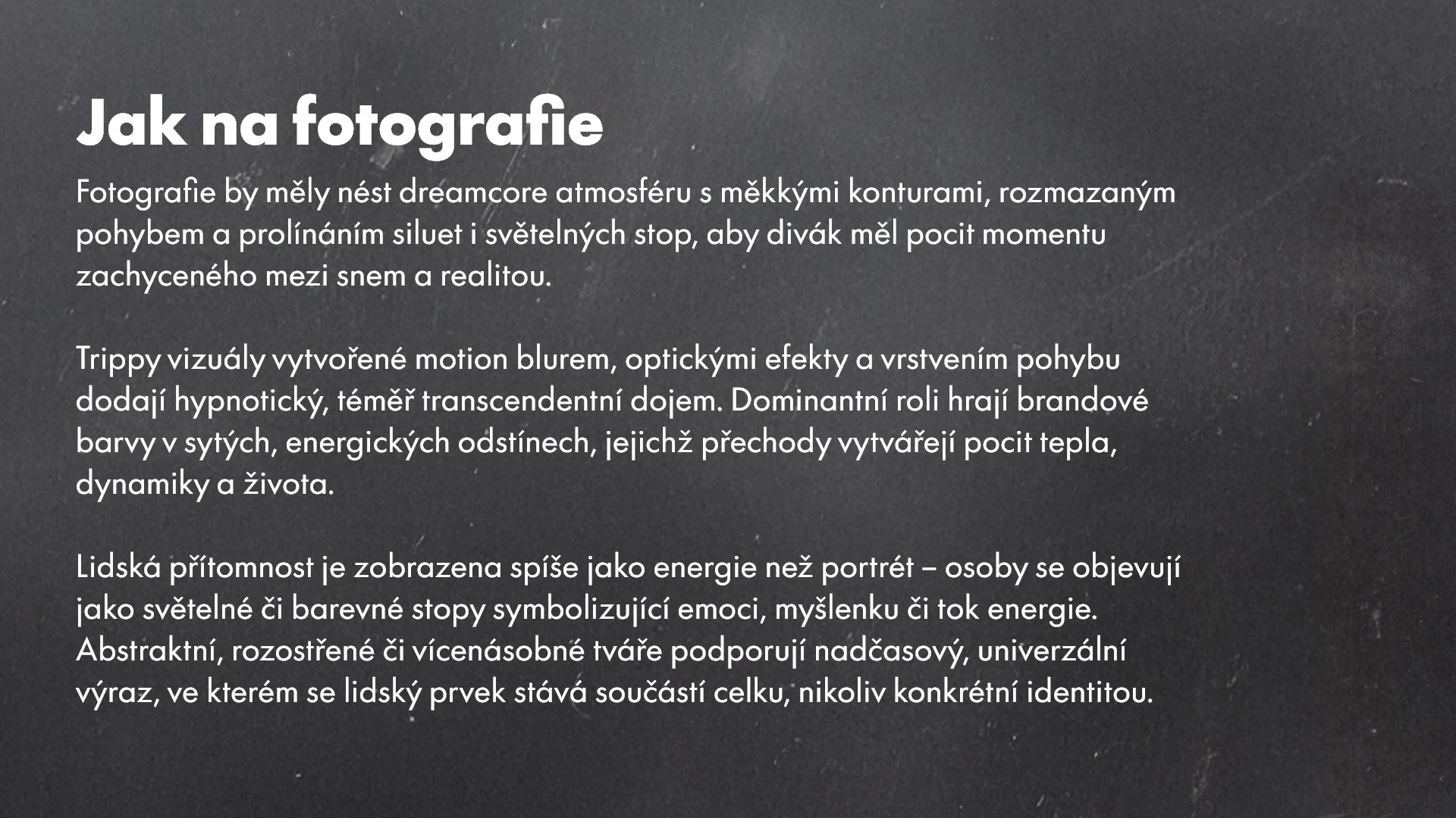
Photography style
Photography is designed to carry a dreamcore atmosphere, using soft contours, motion blur, and overlapping silhouettes or light trails to create the feeling of a moment captured between dream and reality. Trippy visuals created through motion blur, optical effects, and layered movement evoke a hypnotic, almost transcendent experience.
Brand colors play a dominant role in saturated, energetic tones, with gradients that generate a sense of warmth, dynamism, and life. Human presence is represented more as energy than portrait — figures appear as light or color traces symbolizing emotion, thought, or the flow of energy. Abstract, blurred, or multiplied faces support a timeless and universal expression, where the human element becomes part of a greater whole rather than a specific identity. Example:
Brand Identity
The brand identity is bold and distinctive, creating a unique experience for the community and clearly expressing the band’s ideology. To ensure consistency, a comprehensive brand manual was developed, guiding the band in how to accurately apply. Here are few pages of the brand manual: